Earlier today Adobe announced a beta of Photoshop which added an AI-based generative fill capability powered by Adobe Firefly. I have been playing a bit with Firefly to generate images but this new capability integrated into Photoshop is quite remarkable.
On my morning walk this morning, I snapped this photo of Sharon Park in Menlo Park, California. I liked how the sun was breaking out of the morning marine layer and creating some interesting light.
I wished I had taken the image in a 16:9 format so that it was wider – so I brought it into the new Photoshop beta and began using generative fill to enhance the image. Specifically, I added four generative layers which took me about 5 minutes to do (most of that time was me thinking about what I wanted to change!):
Used the crop tool to extend the border of the image to the left – widening the image.
Selected the sidewalk asphalt pavement and replaced it with cobblestone.
Removed the other pavement in the far right of the image and replaced it with lawn.
Added some ducks and ducklings to the pond.
Here’s the result:
A very pleasing result! The image is far from perfect but it’s much more visually interesting that the original right out of my iPhone this morning!
I’m looking forward to exploring more of the capabilities of this generative fill feature and look forward to seeing how Adobe continues to evolve it going forward!
Recently I wrote about a workshop I took from Julieanne Kost and one of the techniques she demonstrated that created a resulting image reminiscent of one of the styles used by artist Pep Ventosa. I included a couple of initial examples in that post.
I’ve continued experimenting with the technique, scouring my Lightroom catalog for multiple images of the same scene that might be good candidates for blending.
Here are a few more examples – from Kyoto and Mumbai – along with my initial examples from Rome and Hong Kong.
Last week I took an online seminar taught by Julieanne Kost and hosted by Santa Fe Workshops. She walked us through many of her creative techniques for image processing including one significant project she did last year called Color of Place.
In this project she wanted to explore the differences in color between various locales around the world that she’s visited during her travels. She put together a portfolio of 25 cities and the colors that she found from her photography in those locales. The results are a series of wonderfully colorful abstract images that display 50 narrow strips of color for each location.
In an online article and video she shared more about her technique using Lightroom Classic and Photoshop. Following her approach I put together my version of the colors of Cuba derived from the images I made during my visit there in 2013.
One of my favorite photographers/artists is Pep Ventosa. He’s known for some very creative Photoshop techniques that blend images in unique and unusual ways. I fell in love with a couple of his styles when I discovered him years ago – and later met him at an Open Studios event he held in San Francisco. We now own several of his prints and have given a couple away as gifts.
Another great photographer who utilizes some very creative techniques for her images is Roxanne Overton – here’s her Instagram feed – she provides me with regular creative inspiration! From time to time she uses techniques similar to what I’m describing here.
Earlier this week, I took an online seminar from Santa Fe Workshops taught by Julieanne Kost, the long-time evangelist for Adobe. Titled “Beyond the Single Image” this workshop focused on Julieanne’s creative process – primarily her approach to compositing multiple images together in Photoshop. She showed a number of techniques – it was a great learning experience. She has an excellent blog where she frequently covers her techniques as well as having been featured in several YouTube videos that cover many of them as well. In addition, she’s an excellent teacher and has several online courses available on LinkedIn Learning/Lynda.com.
One of the most interesting to me was a technique to blend multiple images together in a unique way that, as it turns out, results in an image with some of the same look as one of Pep Ventosa’s styles. When she showed the technique, she used it initially with video – using Photoshop’s video editing capabilities to blend together multiple images from a video to simulate a long exposure image with smooth water. This technique opened my eyes to how Photoshop could be used to perform frame captures from a video file and how she used a technique to blend them together.
The technique can also be used with still images – instead of a video file – to create a blended image that is somewhat analogous to one of Pep Ventosa’s styles. Here’s a step-by-step walkthrough of this technique that I used to create the blend above that I made from four photos taken during a recent visit to Hong Kong. All of my originals are kept in Lightroom Classic – so the process starts there.
Select 3+ (your choice how many) images in grid view in Lightroom Classic. With the images selected, right-click and choose Open as Layers in Photoshop.
In Photoshop, after the layers are all open (may take a minute), select all the layers. Then choose Layer/Smart Objects/Convert to Smart Object.
After the layers have been converted to a Smart Object, choose Layer/Smart Objects/Stack Mode/Mean. This will create a blend of all of the images with a look similar to one of Pep Ventosa’s styles.
Now, you’ll typically want to feature just one element in one of the images – in other words, you will want to bring out some specific details from the blend. To do that, you’ll want to select the appropriate layer with the details that you want to use and then paste it as a new layer on top of the Mean version and begin to do some blending. To do that, double click on the smart object icon in the layers panel. This will open a new Photoshop document with all of the layers shown individually. Select the specific layer that you want and do copy all. Then switch back to the Mean version image and paste – this will create a new layer on top with your selected image. After that you can add a layer mask and you can begin blending as you normally would. Typically I start with a black layer mask and use a brush with white and reduced flow to paint in where I want the details to show.
Once you’re done with blending, flatten the layers and save the image – which will bring the final version back into Lightroom. Or, if you think you may want to re-edit again, you could just save without flattening which will bring it back into LR – but it will be a very large file with all of the layers embedded, etc.
That’s it. It’s a fun technique to experiment with. I’m sure there’s some skill involved in selected the right few images to blend with this technique. You will need to play a bit to learn what strikes your fancy in applying this technique.
Thanks very much to Julieanne for sharing her techniques and helping me learn! Below are some other images I’ve created using this technique. Enjoy!
Last Friday my friends Doug Kaye, Steve Disenhof and I spent some time at the recently re-opened Salesforce Park in San Francisco. This park is above the Transit Center on the roof – elevators at either end bring you up to this roof top level.
One of the fun things to see at the park is a fountain (you can just see the holes for the nozzles in the white ring above) that’s triggered when a bus comes through the Transit Center below. There’s a glass wall behind the fountain that makes for some fun reflections. That’s a reflection of Steve walking in the upper right corner (with the hat!).
With this image, I tweaked it a bit in Lightroom, Photoshop and Topaz Simplify to give it a more painterly effect in black and white. The original image – shot with my iPhone Xs Max – is below:
Here another portrait image from my recent workshop in Santa Fe on “The Language of Black and White”. Our group worked with model Puja Goel I several settings. In this portrait we took advantage of her standing in a corner window with a curtain behind and an open window to her left. The light was magical!
This image was taken using my Sony RX100M6, edited in Lightroom, Photoshop, Portraitureand Snapseed.
My photographer friend Roxanne Overton has pioneered using an easy technique in Photoshop for creatively merging multiple images of the same subject. Doug Kaye wrote about the technique – and how to do it – on his blog a while back.
While multiple images taken from slightly different positions often generates the most interesting results, you can sometimes be surprised by the simplest approach.
Here, for example, is an image taken with my iPhone along the San Francisco Embarcadero yesterday that I processed using the Overton Technique. It was generated from one image. After opening the image in Photoshop, I duplicated the layer and then horizontally flipped it – creating a mirror image. Auto-blend then combined the two layers to generate this results – which I tweaked a bit further back in Lightroom to black and white, etc.
If you’re an Adobe Creative Cloud member and have both Lightroom and Photoshop, give this technique a try. After playing with a few image sequences, you might find one that feels downright brilliantly creative!
Three years ago I was in Havana participating in a person-to-person cultural exchange organized by the Santa Fe Photographic Workshops. One of the photography group leaders at that session was George DeWolfe. While I wasn’t in his group, we did share breakfast a couple of days and I really enjoyed getting to know him a bit more.
After that meeting, I’ve followed George from a distance – and I particularly enjoy the work he’s been doing for years around the notion of adding “presence” to black and white images. I haven’t been using his techniques, however – but a blog post that I read this morning by Julia Anna Gospodarou brought me back to George and re-learning one of his simple techniques for adding presence to an image in Photoshop.
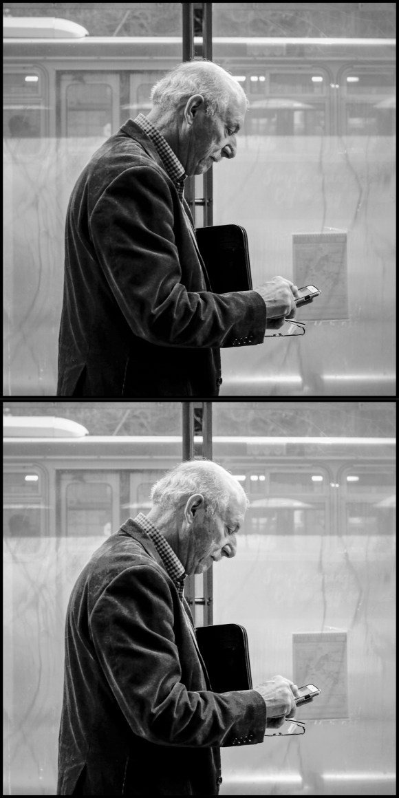
Last night I processed the top image below taken on a photo walk with Doug Kaye in San Francisco last Thursday. We often find the Muni bus stops along San Francisco’s Market Street to be good “stages” – and we await for interesting actors to appear. I was pretty happy with the image last night but when I looked at it again this morning I found it a bit “flat”.
Reading Julia Anna’s interview with George got me motivated to try a quick version of one of his techniques for adding presence – using the Color Range tool in Photoshop to separately adjust the brightness and contract of the highlight, mid-tone, and shadow areas of the image. This is a super easy technique – using the Color Range tool to create a selection of, for example, the highlights in the image – then use a Brightness/Contrast adjustment layer to tweak the brightness and contrast of just the highlights. Do the same thing for the mid-tones and then for the shadows. Takes about 2 minutes to adjust the image this way – and it does help reduce the flatness and spread out the tonality of the image to make it more appealing. The second image below shows the result of my quick adjustments this morning.
There are other ways to accomplish this – with much finer grain control, for example, you can use Tony Kuyper’s Luminosity Mask technique to also do this. But the quickness of using Color Range with a few Brightness/Contrast adjustment layers makes for a very speedy workflow. Thanks to George DeWolfe for sharing this technique – which he first wrote about back in 2007, almost ten years ago.
Here’s an image from June 2015 – walking through Central Park in New York City.
As I processed this image, I first brought it into Photoshop CC 2015 and then used Topaz Simplify 4 to create a black and white simplified later – which smoothed the water and the foliage. Next I used a luminosity mask to have the simplified layer apply primarily to the darks in the image – having the lights and a bit of color punch through.