Three years ago I was in Havana participating in a person-to-person cultural exchange organized by the Santa Fe Photographic Workshops. One of the photography group leaders at that session was George DeWolfe. While I wasn’t in his group, we did share breakfast a couple of days and I really enjoyed getting to know him a bit more.
After that meeting, I’ve followed George from a distance – and I particularly enjoy the work he’s been doing for years around the notion of adding “presence” to black and white images. I haven’t been using his techniques, however – but a blog post that I read this morning by Julia Anna Gospodarou brought me back to George and re-learning one of his simple techniques for adding presence to an image in Photoshop.
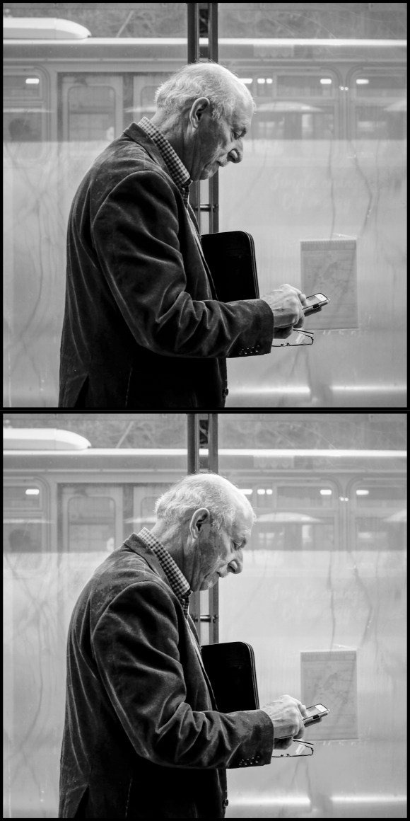
Last night I processed the top image below taken on a photo walk with Doug Kaye in San Francisco last Thursday. We often find the Muni bus stops along San Francisco’s Market Street to be good “stages” – and we await for interesting actors to appear. I was pretty happy with the image last night but when I looked at it again this morning I found it a bit “flat”.
Reading Julia Anna’s interview with George got me motivated to try a quick version of one of his techniques for adding presence – using the Color Range tool in Photoshop to separately adjust the brightness and contract of the highlight, mid-tone, and shadow areas of the image. This is a super easy technique – using the Color Range tool to create a selection of, for example, the highlights in the image – then use a Brightness/Contrast adjustment layer to tweak the brightness and contrast of just the highlights. Do the same thing for the mid-tones and then for the shadows. Takes about 2 minutes to adjust the image this way – and it does help reduce the flatness and spread out the tonality of the image to make it more appealing. The second image below shows the result of my quick adjustments this morning.
There are other ways to accomplish this – with much finer grain control, for example, you can use Tony Kuyper’s Luminosity Mask technique to also do this. But the quickness of using Color Range with a few Brightness/Contrast adjustment layers makes for a very speedy workflow. Thanks to George DeWolfe for sharing this technique – which he first wrote about back in 2007, almost ten years ago.
2 replies on “Adding Presence to Black and White Photos”
Nice article and great example.
Brilliant Scott thank you Goimg to look at those links right now Thanks for posting this