With several photographer friends, I recently attended a lecture by photographer John Paul Caponigro sponsored by the Palo Alto Camera Club. He spoke on the subjects of “Illuminating Creativity” and “Landscapes Within”. A 20 minute version of his creativity talk from 2010 is available as a TEDx video.
Caponigro’s purpose in his talk was to push us to explore our own creativity – to realize that we’ve got a lot more that we might not even realize. I’m not sure about that in my case (!) – but I tried to take some of what he taught to bear on this particular image.
It’s a morning sunrise shot from the Kona coast in Hawaii. Sunrise, of course, occurs in the east – and this image looks to the west – off the coastline of the Kona coast on the big island of Hawaii. There was a lovely bank of low clouds (not visible in the image) which were reflecting lovely sunrise colors down into the ocean waters – and that’s what I tried to capture as I processed this image.
Processing involved several steps – including an excursion into Lab color, selective use of Topaz Simplify, some luminosity painting – and other steps I’ve already forgotten!
This is one of those special images that brings me back – back to a very special early morning, walking along the coast in Hawaii and watching the light slowly shift and sparkle. Beautiful. A beautiful memory. For me, that’s what creativity is all about.
On our first morning in Havana (January 24, 2013), I headed out on Dawn Patrol (our leader’s term for departing the hotel at 6:15 AM sharp). We walked down to the harbor and then worked our way back. Along the way back, I snapped this image of a Havana street scene just waking up.
In this image, I’m putting to use some new techniques learned in a Photoshop workshop with Mark Lindsay. Doug Kaye and I had very much enjoyed an earlier workshop with Mark last fall and we were looking to learn even more.
The basics of the technique used in this image involve the following workflow:
Color cast adjustment – using info points and Lab color indications to neutralize blues.
Luminosity adjustment – using channel curves to add contrast and detail into the most interesting areas of the image.
Lab color – using the Multiply blend mode technique along with a luminance channel layer mask to enhance the colors.
Sharpening – by going back to RGB and using Unsharp Mask to apply “hiraloam sharpening” – hi radius, low amount.
The original image I started with had a substantial blue cast on the trees. In this version, the colors are much more accurate.
Earlier today, Adobe’s Julieanne Kost shared some images of succulents she made using the Oil Paint filter in Photoshop CS6. They were great – and brought me back to images of a succulent wall that I had taken using my tiny Canon PowerShot S90 at the Sunset Magazine Celebration Weekend in June 2010. This was a display by Succulent Gardens of Castroville, CA.
I pulled this image into Photoshop and tweaked the Oil Paint filter in initially add the artistic strokes. After that, I followed with a modified Picture Postcard workflow to add more depth followed by a trip in Lab color to bring out some of the colors. Fun!
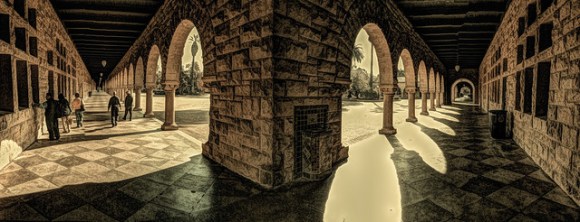
Lily and I took advantage of a beautiful Saturday morning to head out for a walk at Stanford. We parked near the old Chemistry Building and then made a gentle loop of the Quad.
The photo above was shot with my iPhone 5 and then tweaked using one of my latest Lab color workflows in Photoshop CS6.
The photo below was shot on my iPhone 5 in Panorama mode and then tweaked in the iPhone using Painteresque and Snapseed.
It was a wonderful fall day for a walk on the campus! And I continue to really enjoy my minimalist photography – with just the iPhone 5 camera in my pocket!
This is another one of my older images – from a January morning in 2010 when I was at the Golden Gate Bridge shooting with my tiny Canon PowerShot S90 camera. This is a three shot HDR (High Dynamic Range) image – blended in Photoshop using HDR Pro and then tweaked using my latest Lab color workflow and some other tricks. I remember being cold and damp on this particular morning – and this image brings back memories of that mood!
A few days ago, I shared a before and after pair of images of a Maine lighthouse photo shot by my friend Jim Rowson. I loved his composition and the lighting in his image. Since I had been learning some new photo enhancement techniques with my friend and photo buddy Doug Kaye, I asked Jim if it’d be OK for me to share his image here on my blog along with an enhanced version. That was OK with him!
By way of reference, here’s Jim’s original image:
and here’s my edited version:
In my earlier post I really didn’t provide any details about the enhancements steps I took to adjust and, hopefully, improve this great image. In this post, I will share with you what I can remember about this process.
My work here is the result of lot of concentrated learning over the last month or so – beginning with a workshop that Doug arranged with Mark Lindsay. From there, I’ve learned a whole lot more – and I’ll include a list of the most important resources I’ve found at the end of this post.
As an aside, one of the great shortcomings of today’s photo editing tools is how it’s so difficult to actually log the changes one makes to an image. You can, of course, choose to keep the fully edited version (in Photoshop these can be very large PSD files) – or, if you’re like me, you can just complete your editing in Photoshop, commit your changes (by merging down the layers), and save the final result back into Lightroom. Too bad there isn’t a better way to do all of this – one which doesn’t eat up huge amounts of disk space while still providing the opportunity to look back and learn from a particular editing experience. Seems like an opportunity here for providing a much better experience!
So much for my lament, let’s get back to Jim’s image – and my editing of it.
Because I started with a relatively small size JPEG version of the file from Jim (and not the original RAW file out of his camera), I completely skipped the otherwise important workflow steps involving the initial RAW processing of an image I might have shot in the field. I switched to Lightroom (from Apple’s Aperture) a couple of years ago and it’s been my photo database and RAW processor since then. As Doug described in his recent workflow post, I do the basics in Lightroom (Lens Calibration, Camera Profile, White Balance, basic Exposure, etc.) but then do an export of the image to Photoshop where the bulk of my serious image editing takes place. For most images, Lightroom’s editing tools are more than adequate – but for those special images need more serious blending and “chording”, a trip to Photoshop always results.
I’ve included below an annotated snapshot of my layers in Photoshop from editing Jim’s original image. Let me walk through each layer in turn – from the bottom to the top – as I added them in Photoshop while editing this image.
The original image comes into Photoshop as a Background layer. I’ve recently learned (from Mark Lindsay, Lee Varis and Dan Margulis among others) the techniques associated with improving images using Lab color and other techniques. These techniques typically begin by examining the three color channels of the RGB image (Red, Green, Blue) and selecting the one with the most interesting contrast to use as the basis for the second layer.
To get there, I created a new layer – the second layer from the bottom in the diagram – somewhat confusingly labeled as Layer 1 in the diagram – and then used the Apply Image commend to select the Blue channel and load it into the layer. I then changed the layer blend mode for that layer to Luminosity – so that only the tonality of the image is adjusted by the Blue channel. (Note that for most images the Green channel is actually the best one to use for this first step – but in looking at all three channels of this image I decided that the Blue channel provided the most interest).
Next, for the third layer (labeled Layer 2 in the diagram) I created another new layer, this time also creating a Clipping Mask to link this layer with the second layer. You can tell that a Clipping Mask is applied by the indentation of that particular layer in the Layers panel. I then used Apply Image to load the Green channel into this layer and selected the Multiply blend mode to darken the image. Multiply typically goes too far, however – so I reduced the opacity of this channel to 20% which, to my eye, looked about right.
For the fourth layer, I duplicated the third layer and applied Overlay blend mode along with a Clipping Mask. I only wanted the Overlay effect to apply to the brighter portions of the layer – so I used the Blend If option of Layer Styles to eliminate the effect on tones darker than neutral (128).
For the fifth – and final tonality adjustment layer – I added another new layer with a Clipping Mask and used Apply Image to load the Red channel (the brightest of the three). I used the Color Dodge blend mode to have this brighten the sky area. I applied a layer mask using the gradient tool to block the effect of this layer on all of the areas below the sky.
Next, I duplicated this image – with the five layers so far – and selected Merge Layers while duplicating. I switched to the duplicate image – now a single layer – and immediate changed the image into Lab color. Next, I added a new layer in Overlay mode. I used a Layer Style option to eliminate the L channel from the layer. I then merged the two layers into one, used the Move tool (with shift) to move the image back on top of the original image. I made sure the new layer was the topmost layer of the original image and released any Clipping Mask that might have remained. I then changed the blend mode of the layer to Color and adjusted the opacity to my taste.
For the seventh layer, I brought in some luminosity from the Lab version’s b channel – using Overlay blend mode and adjusting opacity to taste – ending up at 45% opacity. This is totally subjective and done according to taste. Depending upon the colors in the image, the a or b channel from the Lab version might be better – you can try one or the other – or decide just to skip this layer.
Next, I duplicated the image once again – again merging the layers. I switched this duplicate’s mode immediately to CMYK color. Using the Channels menu, I selected the Black channel and applied a contrast enhancing curve to the black channel. This is a bit tricky – you need to be sure the black channel is the only one selected, etc. The goal is to have a stark contrast in this channel.
I then came back to the original image and added a Solid Color adjustment layer – using neutral grey (128 with no saturation). I applied a layer mask and loaded it using Apply Image from the Black channel of the CMYK image. I then switched the image to Color blend mode. This step is intended to reduce any inappropriate color tones from the shadow areas of the image.
At this point, I’ve completed the core adjustments in Photoshop. At this point, I selected all of the layers and flattened the image to a single layer.
Next, I used a couple of Photoshop plug-ins to complete the image. First, I used ALCE 2.1 (at 50 percent in Turbo mode) to add local contrast to the image. Second, I used the Margulis Picture Perfect Workflow panel (free download) to sharpen – specifically using his Sharpen 2012. And, finally, I used Nik’s Dfine to reduce any noise remaining in the sky portion of the image.
That’s it. Each step takes you along the path from a nice image to a much more interesting version.
Resources
We stand on the shoulders of giants someone once said – and, certainly, when it comes to image adjustment in Photoshop that’s very true. In my particular case, I benefited greatly from the following:
Dan Margulis – Dan seems to be the father of Lab color – or at least from the standpoint of teaching it to us mere mortals. His Kelby Training videos are good – but his style is one I find challenging – viewing them a couple of times through helps a lot. His book on the subject – Photoshop LAB Color: The Canyon Conundrum and Other Adventures in the Most Powerful Colorspace – is the definitive reference and worth owning – and reading!
What’s Next?
I feel very much like I’m just on the cusp of understanding what’s happening here. Photoshop is such a complex program – with a user interface that adds complexity while enabling great power.
I’m hoping some of these techniques “stick” with me – based on a more fundamental understanding of what they’re about, how they work in the context of what’s being manipulated, and great familiarity with using Photoshop.
Over the summer, I felt like I had finally broken through some sort of plateau in my understanding of image manipulation. The last four weeks have kicked that appreciation into “turbo mode” – here’s hoping things stick and settle down going forward!
Please let me know if any of this helps you in your struggles like mine towards better images! I’d love to hear from you!


You must be logged in to post a comment.